Friday, October 30, 2009

#95...costume from cans


A few years ago, while taking some fashion design courses at a local community college, I entered their annual Flasn-n-Trash contest that required entrants to make a garment out of some type of trash. Above is the outfit that I made for the contest. I made the white, one shoulder dress out of Tyvek sacks that landscaping stones came in. The title of my piece was rain, and to create the drops, I cut open, about 75 soda cans and sculpted them into the spiraling 3-D buttons that adorned the dress and head band. To complete the effect of rain, I cut up an old silver reflective car windshield protector into strips, knotted the strips together, and then knitted the long strand into a slouchy legwarmer that was meant to represent a puddle. At the same time that I was in this fashion class, I was also taking a film photography class through the Museum of Fine Arts Houston. The above photos were taken for a self portrait class assignment, and in the spirit of dressing up, I thought they would be fun to share on the eve of Halloween!

Wednesday, October 28, 2009

#94...kid's room for two

I recently helped my client Hilary decorate her kid's room. The room is shared by sister/brother duo Reese and Matson, and Hilary wanted to give it some personality, color and a pulled together look that worked for both kids. She already had all of the furniture in the room, the chocolate brown drapes, the crib bedding, and an idea that she wanted a bold green for the walls. We chose Hep Green by Sherwin Williams for the bottom of the wall, and Limelight for the top. The furniture arrangement stayed close to how she originally had it, except we swapped the bed and the crib to create more room in the play corner, and to fit the kitchen. We added Ikea Lack wall shelves above the existing Ikea Expedit to display frames, and treasured items, like the adorable ceramic lion clock that their grandmother painted for them. Below are a few of the hand-made items in the room. You can see more room photos right here on my flickr photostream.
Including the beach ball pillow from my last post, I created a number of personalized, easy to make decorative items for the room that I think really add to the room's cute factor. I created monogram wall art to hang above their beds. For Matson's, I used wood letters that Hilary already had. They were white, so I spray painted them orange, and glued the "D" to a 12x12 inch gallery canvas that I wrapped in an Amy Butler fabric that we used in the room.
For Reese's initials, I blew up a Microsoft Word font to 450% and cut the letters out of coordinating blue card stock, and mounted them on fabrics used in her beach ball pillow. They are framed in square frames from Ikea that Hilary already owned.
Reese's quilt and brightly colored sheet set are from HomeGoods and her bed skirt I made using striped pink/white fabric that is simply hot glued to the underside of the metal bed rails. When they want a change, it will be easy to pull off with no damage to the rails.
They already had this Ikea lamp, which simply got a face lift with the orange fabric trim.
In lieu of closet doors, we went with some white shower curtains that I embellished with fabric to create a one-of-a kind closet closure.
This charming lion is the elementary school artwork of Reese and Matson's Dad Matt. It was previously framed, but it did not quite match the new room colors, so I gave the frame a face lift with orange paint and added fabric to the mat to make the lion really shine. In the playroom corner of the room, there is a water color flower also done by Matt that received a similar framing face lift, which you can see here.

Monday, October 26, 2009

#93...beach ball for the bed

I recently made this fun beach ball pillow for a client whose kid's room I helped decorate. I will be sharing the room results later this week; however, today I wanted to share the beach ball pillow, because it is so cute atop the little girl's bed! It looks like a complex pillow to make, but really it was quite simple.
I used Vogue pattern V8058 that I picked up in the sale bin at the local fabric store. Unfortunately, the pattern is discontinued, but you can get your own right here on Ebay. It is a really versatile pattern, just look at all the cool pillow options that you can make with just this one pattern.
I did alter the pattern a bit to create Reese's beach ball pillow. The pattern called for a button on each end of the intersecting pie pieces that make up the ball. I was worried the safety of buttons, and about how buttons would hold up on a kid's bed pillow, so I decided to applique two large circles onto the ends in lieu of the buttons. I used a blanket stitch to secure the end dots to the pillow. This project took about 2 hours to complete.

Friday, October 23, 2009

#92...sarah's chairs

My friend and client Sarah, inherited these tired wicker chairs. She wanted to give them a face lift, so I sprayed them black for her to help freshen them up. We chose a Flat Black lacquer, because I think that semi-gloss or gloss finishes sprayed on wicker looks a little circa 1980's.

The beautiful seat cushions and monogrammed pillows were made by the talented Vanessa of Jacquelyn Reese.

Wednesday, October 21, 2009

#91...e-decorating

My friend Teri, who lives several states away from me, wrote asking if I could help her decorate her daughter's room from a distance. In searching for a way to compile pictures and product links that would give her the blue print she needed to pull together the room, I found the website of Turquoise, a design firm from L.A. They seem to have a well established e-decorating service with an impressive portfolio of virtually decorated rooms, and they make the concept of e-decorating seem simple.

This is the the "e-design board" that I put together for Lily's room. I separately compiled a source list of links for all of the items and ideas to go along with it.

Teri sent me pics of her room and a list of needs. I spent about 5 hours putting my ideas together, sourcing products, and drafting the link list. I really liked doing it......which got me thinking that maybe there are others out there who may like a decorating blueprint of this sort. I wonder if I could sell personally customized decorating plans on Etsy?

Monday, October 19, 2009

#90...under the giant moon

Since the weather finally started turning cooler, and daylight is fading, I decided to add a little lighted ambiance to my deck. I had this red wicker candle holder lying around in my garage, and decided to make it into an outdoor hanging lantern. I spray painted it white, and stuffed it with holiday light strands. It is suspended from the rafters of our Pergola, and the cording runs overhead and then down, and plugs into a corner outlet on the back of the house.

It reminds me of a giant low hanging moon. In playing around with the camera settings to get a shot of the lighted globe, we ended up creating these ghostly apparitions....just in time for Halloween!


Friday, October 16, 2009

#89... oil pourers

Tyler is the chef in our house, and he asked for some pourers for Olive Oil and Grape Seed Oil, so that he would not have to constantly fumble with large bulk bottles from Costco, and actually leave them out near the stove.

Tomorrow is his birthday, so I thought I would surprise him with some. I wanted to simply use vintage bottles and add new pourers; however, I had a disappointing trip to the resale shops, and could not come up with any old bottles that did not look like they had once housed motor oil. I stopped by a $1 store, and found these pourers (at right). Since roosters are not really my style, I decided to embellish the jars.

I have this Dover Decorative Letters book that has a CD-rom with it, so I created the words "Olive" and "Grape" and simply sized them down and printed them out. I wrapped a sleeve of decorative paper around the rooster motif and using Mod Podge I adhered the decorative paper and then the words. I painted the Mod Podge over the entire sleeve with several coats and let dry. Mod Podge goes on white, but dries clear and creates a latex coating over the paper that will be easy to wipe up. We'll see how messy a chef he is to how long the cute sleeves last. This project took about an hour to complete, and was super easy, as I did it with my eyes glued to Project Runway last night!

Wednesday, October 14, 2009

#88...tie strapping

I bought this vintage tie at a resale shop for $1 And turned it into a new strap for my camera, following these instructions


The pattern called for a strip of fabric about 23 inches x 4 inches. I opened up the tie (see below), removed the liner, and did some seaming to get my strip to the right length. Other than that small modification, I followed the instructions step-by-step. The whole project took less than 30 minutes to complete.

Tuesday, October 13, 2009

Monday, October 12, 2009

#86...embellished plant pot


We did some replanting of our outdoor pots this past weekend, as summer heat had really demolished all former plantlife. While planting this pot above, I realized it was a DIY project that I could share.

A few years ago when I was cutting tiles for my kitchen from clay, I was left with a bunch of small mosaic like clay pieces from the edges of the rolled out clay. I went ahead and glazed and fired the pieces instead of scraping them, but I was not sure how or if I could ever use them. When cleaning my garage out last year, I found the forgotten pieces in a shoebox, and decided to embellish the above plain terra-cotta pot with my pottery pieces. I simply used Construction Grade Liquid Nails to glue them on, and they have held on through cold, extreme heat, and humid Houston weather. This project would be fun with old seashells or sea glass, or bottle caps, or broken china, or pennies, or......you get the idea.

I repotted my front porch pots too, with pink bromelaids, and cyclamen. I think they look pretty, so I took some pictures..... however, I did not make or embellish these pots.

Friday, October 9, 2009

#85...tools I can't live without

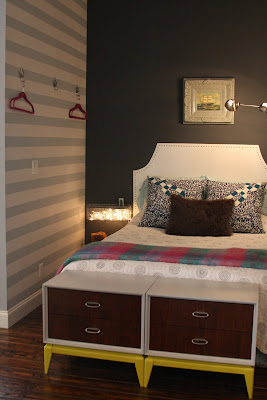
I really can't live without blue painter's tape. It has allowed me to create wallpaper like designs, stripes, and color blocks on my walls. There are endless uses for it in addition to being a great paint tool. Check out this list from Fun Times Guide that suggests some unique uses for blue painter's tape. Sold at every home improvement store, the beauty of it is that it peels off without leaving a sticky mess or pulling off paint underneath. I have seen the new green Frog tape, but not tried it yet....not sure if I am willing to switch!
Below are photos of various walls in my house where I have created a design using blue painter's tape. There are a few tips I have to offer when doing a large project like these.
  • Make sure the underneath wall color is completely dry. Although it may feel dry to the touch, let it sit for a few days to insure that the painter's tape will not pull the paint off when you use it.
  • For stripes, use a long level or other large straight edge to draw your design onto the wall with light pencil first. Next, tape off along the pencil edge such that the new color will cover your pencil mark.
  • After painting with the new color pull the paint off before it totally dries to avoid ripping off some of the new paint.
  • If your walls are textured, you may have some bleed under the paint. I use a small artists brush to go back and clean up the edges of my design. It is painstaking work, but really makes the edges clean and straight looking.
various widths of tape were used to create this tree like pattern
6" black stripes added on top of white wallsabstract squares taped off randomly without a guide,
therefore some are not perfectly square, (but no one can tell)
4" grey horizontal stripes painted onto lighter grey base
(also, painter's tape was used to create the tromp l'oeil headboard)
wide vertical stripe added to green wall to set off sculpturehorizontal stripe that wraps corner to highlight metal sculpture

Wednesday, October 7, 2009

#84...love MOO

I am quite fond of the print company MOO. They print a nice variety of cards using sustainable papers, and their website is easy to navigate. They originated in London, but recently set up shop stateside, in Rhode Island. There is even a Flickr group with inspiring design ideas to get you thinking about creating a set of your own MOO cards. I love that I can make two-sided cards using my own photos for a reasonable price. Here are three of my MOO print projects.

moo mini cards that advertise my ETSY shop, using select hand painted designs

moo postcards made as rehearsal dinner invites,
using a photo that I drew on with a silver sharpie, and then scanned to upload
moo business cards for my home staging and interior design ventures,
using photos of rooms that I decorated
I clipped the rounded corners on the business cards myself using a corner clipper found at a local craft supply store
the business cards and mini cards both came in cute storage boxes
I added one of my fabric logos to the business card box to personalize my card holder

Monday, October 5, 2009

#83...table solutions

This $17 resale, metal and laminate, Chinese card table, featuring rusty, short foldable legs plus this $12 resale ottoman/basket thingy (I spray painted it black and turned it upside down)

equals this new coffee table for my front room!


Thursday, October 1, 2009

#82...cut-offs for all

I am on the fence about denim cut-off shorts. They look good in ads like this one from Refinery 29, however, for the most part I am baffeled as to how jeans that are so comfortable and flattering can turn into shorts that are awkward and uncomfortable. I probably need to invest in some pre-made cut-offs like these from Madewell, but for now, I will continue to alter my jeans, hoping to create the perfect pair of cut-offs.

I am headed to ACL music festival this weekend, and am in the mood to don some cut-offs, so I chose a pair of my jeans that had a hole in the knee and began the quick, cheap, DIY.

Here are my jeans before:

Next, I tried them on and held a measuring tape from the side waist seam down my leg to determine the length. I searched online for some guidance as to what length would look the best and this is what I found on blogher.com To quote... "A good rule of thumb is that your shorts should hit no higher than mid-thigh, and no lower than the tops of your knees. Ideally the hem of your shorts will fall right to the slimmest part of your thigh; that draws the eye to that particular spot and makes your leg look long and slim. Contrary to popular belief, a longer hemline is not necessarily the most flattering or slimming; going slightly shorter will emphasize your curves and make your legs look more shapely."

According to this, my ideal length is 13.5 inches, so I used a ruler to mark a straight line across the leg at that point. You can faintly see the orange pencil pointing to my marked cut line.Next, I cut and voila! shorts! I decided not to really spend time fraying mine, as the first time I wash them they will start to fray, and fraying them won't make them look any more or less like cut-off jeans.