Thursday, January 28, 2010

#132...carribean colored office makeover

This page from Domino's Decorating Book, was the inspiration behind my client Sara's office makeover. Sara's family is from Trinidad, and the bright colors of this room really reminded her of the Carribean. She has collected a lot of brightly colored artwork from the islands, and the ocean blue wall color served as a nice backdrop for her vivid collections.
before

after
This room serves as an office, guest room (pull out sofa) and exercise room. We worked with what Sara already had, and added some personality to the room with the vivid colors, new rug, and a few items that I made, including the recovered desk chair and skirted file cabinet, the spruced up side table with mirror that I glued round slices of seashells to, the window pelmet and hand painted lampshade, the large scale abstract art piece that I did on linen and stretched onto a giant wood frame, and the sweet potato stamped desk makeover.


before

after

before
after

Wednesday, January 27, 2010

#131...sweet potato stamped desk

Another big project that I did for my client Sara's office was to makeover her dated desk and file cabinet, using some wood, paint and a sweet potato!

I cut the end off a sweet potato, gouged out the center with a melon baller and had an instant (and free) stamp for embellishing the desk. But I'm getting ahead of myself......here are the steps I took to update the desk and create a new, bigger work surface for Sara.
First, I measured the surface area of the desk and file cabinet, which we positioned so that it would be a corner work space. I cut a new desk top from plywood sheets using a table saw.
Next, I fitted my pieces on the top of the desk. (You can see I mis-measured and mis-cut the piece on the right on my first try). I also added the small front panel that is just to the left of the file cabinet to cover the corner hole where the two pieces of furniture meet.
 I painted the new desk top and desk base in a dark chocolate brown. Then it was time to stamp my sweet potato, which I simply rubbed in red paint and stamped and twisted it across my boards to give an effect like this.
I varnished the surface with Wipe-on Poly and simply placed the new top on the old one. Initially, I thought that I would somehow have to secure the new top to the desk, but the weight of the plywood top actually holds it in place without any need for attaching it.

Tuesday, January 26, 2010

#130...side table update

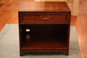
I got this little side table at the Goodwill for about $12. It was in pretty good shape minus some scratches and wear on the top, and the jagged hole someone had cut in the back of it, I assume for wires.

To personalize and refresh the piece for its new home in my client's office, I painted out the top, sides, drawer front, and interior with cherry red paint. Next, I gave the painted panels a faux linen look by diluting brown acrylic paint, painting the brown glaze over the surface and then dragging the above plastic painters comb vertically and horizontally across the surface removing some of the glaze.
I also cut a new back for the cabinet from foam core, wrapped it in a coordinating red faux leather vinyl and wedged it into the back of the cabinet to hide the hole. I varnished the entire piece with this satin finish Wipe-on-Poly.
It is a subtle change, and a little hard to see in these pictures, but the piece looks a lot nicer. I'll share the results from this room makeover later this week.

Monday, January 25, 2010

#129...frame transformation

I needed a frame 12"x18", which is an odd size, and did not want to pay for a custom made frame. I found this plain, brown frame, and decided to embellish and change the color to give it the look I wanted.
First, I wanted to add a little dimension to the frame, so I used some tacky glue I had lying around, and squeezed dots onto the frame, giving it a nailhead look.
Once the glue droplets dried, I spray painted the frame in black satin.
Next, using a sea sponge and silver acrylic artist's paint, I sponged and wiped silver on the frame to give it an antiqued look.
This is the finished product. I framed a photo by my sister Sarah, that is going to hang in my Mom's entry way.

Friday, January 22, 2010

#128...mom's family room

Over the past year, I have been helping my parents do a little redecorating and updating in their house. You can see our living room efforts here, and our dining room makeover here. We recently finished the family room.
family room before
(the towels on the furniture are for the cats and not usually there...sorry for showing them Mom)

.....and now for the after

Mom and Dad's taste is very traditional, and we merely rearranged, rehung and added a few new things to the furniture they already had. The room layout stayed exactly the same. The biggest change in the room is the accent wall that we painted in Sherwin Williams Hopsack. I then decided to turn the TV into a gallery art wall, to help hide the giant TV that really stood out on the wall before. Most of the artwork they already had, including some crewel work pieces my mom did in the 1970's, a tiny oil painting my parents got on their Florida honeymoon in 1972, some paintings my sister Sarah did in middle school, and a few paintings that my great uncle did in the 1960's. I added a few paintings of my own to the gallery, including the red squares with white flowers that you see above. My Dad built the enormous entertainment center himself, (he is still working on the glass door fronts.)

We removed the dark wood bookcases that were previously in the room, and changed them out for the Billy bookcase from Ikea. The Billy Bookcases are thinner that the old bookcases, allowing more space to walk around that part of the room, and we were able to move my Dad's secretary desk into a more functional corner. We added Ikea bookcase lights to the top of the Billy, which really add a lot of light and warmth to the room. I painted out the back of the bookcases with the same Hopsack color as the accent wall, then Sarah and I spent an afternoon editing and displaying the bookcase cubbies.
The windows previously had mini blinds on them, and we removed those, and put up custom louvered wood shutters, which are really pretty......and hard to see in these photos due to the sunlight.

Wednesday, January 20, 2010

#127...I heart lemon squares


For my birthday in the fall, I received this 2-in-1 lemon/lime squeezer. I never got a chance to try it out during the busy holiday season, so I pulled it out this week, and made myself some lemon squares. It worked like a dream, making squeezing the lemons fun. I can't believe how easy it was, and how much juice it squeezed from each lemon. I highly recommend it for those lemon lovers out there.
Lemon squares are my favorite dessert, and my Aunt Patty's recipe is the absolute best!

(If you read this Aunt Patty, I want you to know that I savored them, and did not make myself sick eating them all at once.....however, next time you bake them no promises!)

Tuesday, January 19, 2010

#126...from basic bathroom to black

I recently helped my client Scott turn his bathroom into a dramatic gallery of artwork. He collects vintage book covers and posters from the 1950's, and wanted to display them in his half bath.
before
after

Since the artwork is so colorful, I felt that painting the bathroom black would give it a dramatic, yet neutral background to show off the pieces. We chose Black Onyx by Benjamin Moore for the walls, and framed the artwork in both black and white frames, purchased during Aaron Brother's "buy one frame, get one for a penny sale"....which happens twice a year. Scott also had some vintage cologne from the 1960's, complete with instructions on "how to charm the ladies" that we displayed in a shadow box near the sink. This was a fun, unique project with a one-of-a-kind result.
before

after


Monday, January 18, 2010

Friday, January 15, 2010

#124...scrap circle pillow

I felt like the white quilted boudoir pillow on my bed looked a little too plain.
I got inspired by the Layla pillow from Crate&Barrel
I used a circular roll of tape, a spool of thread, and a circular juice glass and traced various size circles onto scraps of grey crushed velvet, and grey wool felt.

I arranged and pinned the circles in a pattern that I liked. Then I hand tacked the circles to the pillow using a running straight stitch that took me about an hour. I already had the scraps of fabric, so this pillow update cost me $0, and I think it added the personality that was missing from my bedding.

Wednesday, January 13, 2010

#123...dressed up dishtowels

I love pretty dishtowels, and decided to embellish some plain dishtowels with a stripe of fabric to give as a gift. It was one of the simplest sewing projects I've ever done.
Supplies:
Plain dish towels like these
Fabric strip that measures about 4 inches by whatever the width of the towel plus two inches to turn under...(for example if your towel is 24" wide cut the strip 4" by 26")

To Make:
Iron under half an inch on each long side of strip
Pin to front of towel (mark up from bottom to make sure your stripe is straight across)
Top-stitch along each long turned under edge and fold sides around to the back of the towel for a finished look. Press flat and you're done!
In addition to the dish towels, I made some potholders to give along with them. For the potholders I simply cut 7 inch squares of fabric and rounded the corners off. I used two layers of this insulated lining on the inside of the potholder. I pinned all layers together and top stitched a square to hold all layers together. To finish off the edges and make the hanging loop, I used bias tape that I made from the fabric I used on the dish towels. Potholders are also fairly easy to make and here is a good tutorial I found.