Friday, July 30, 2010

#215...wrapping up my week at the beach

Here are a few shots from my week at the Jersey shore,
starting with some nice beach houses....
and a cute beach baby.........
and her cute crab bag......
and a tiny beach buggy.....
and the swing ride that nearly made me lose my crab & steak dinner!

Wednesday, July 28, 2010

#214...DIY sandcastles and bikini repair

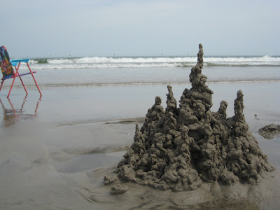
Easy to make drip sandcastle that looks like it's straight out of a Dr. Seuss book.

Simple safety pin solution to a broken bikini top.

Monday, July 26, 2010

#213...greetings from the jersey shore

My extended family is spending the week in Ocean City, New Jersey. It is a pleasant 88 today and breezy, which is a nice break from Houston weather.

Published with Blogger-droid v1.4.8

Thursday, July 22, 2010

#212...cats love good design

I guess cats like good design too, evidenced by the "best of cats" list up on design*sponge today. My cat Gig'em made the list, although he was less than thrilled that I was photographing him that day.
the d*s post sort of reminds me of "pets on furniture" on desire to inspire, that they do each Monday. Here's Gig'em in another spot on the bed....and my dog Mazie.

Wednesday, July 21, 2010

#211...e-decorating update

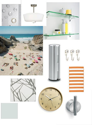
I have been selling my e-decorating services on etsy for a few months now, and I thought I would share some of the boards I have created for clients. It is good for me to go back and revisit them to see where I can improve in offering this service, and building the boards. The boards all come with extensive link lists to the suggested furnishings, accessories, and fabrics on the board as well as additional options to consider. Each board is catered to the needs of the individual project. Some rooms don't need furniture, they simply needed ideas to work with the existing furniture to give the room a new look. All the rooms work within a budget range provided by the client. 

This board was done for a Master Bedroom suite, working with a Tahitian wood carved bed (not pictured) and a portrait of the homeowner (seen on the right side of the board)


This board is a playroom for two sisters age 7 and 10. The walls got painted light gray to help ground all the bright colors and give it a little sophistication.


This board was done to add accessories and some personality to a very small and bland bathroom.

This board is for a baby girl's nursery. The mother requested a vintage, shabby chic style.


This board is the room design for an energetic four year old little girl named Sofie. Sofie loves nature and cats.


This board is another Master Bedroom design.

So, how do you think I'm doing creating these e-boards?
Do you get a visual image of the room by looking at the board?

Monday, July 19, 2010

#210...new hampshire (take two)

Sadly, the blogger application on my phone will only let me attach one photo per post. If anyone knows of a more advanced blogging app compatible with the droid by verizon, please let me know. The above picture is of a large tomb located on my grandparents' property of the former owner. The tomb is enscribed J.Davis 1860. My uncle built the rock retaining wall to keep the land from eroding and the tomb entact. Years ago, some of the older grandkids tortured the younger with stories of the "J" man haunting the house. I'm pretty sure I heard him knocking between the walls last night!

Published with Blogger-droid v1.4.8

#210...new hampshire


I've been visiting New Hampshire for the past few days, helping my grandmother get settled in after making the move from her house to a nursing home. It is a hard stage of life, but she is adjusting pretty well, and hopefully will be comfortable there. Before coming up here I got a new phone and have been trying out the camera and figuring out how to blog. Here are a few of my shots.
Published with Blogger-droid v1.4.8

Wednesday, July 14, 2010

#209...inside my kitchen drawers

While I said that my kitchen was finished and posted pictures of it here.......I fibbed a little, as I still needed to paint the interior drawers of the new cabinetry that we added to the space. The exterior of the cabinet is painted in "paris rain" by Benjamin Moore. For the interior drawer color I took inspiration from my cherry Le Creuset french oven. I chose "ruby red" from Benjamin Moore. Then entire cabinet interior and exterior is painted in Satin Impervo Alkyd. We also recently added a quarter inch thick piece of black glass to the top, to help it tie in with our silestone black countertops in the rest of the kitchen. 

Monday, July 12, 2010

#208...julie's fireplace makeover

fireplace before
When I was out at my sister's house in May, she and I performed a fast "while you were out" style makeover on her master bedroom fireplace, while her husband was out at a baseball game. Julie really hated the 1980's tile surround on the fireplace, and wanted to do something quick and cosmetic to give it a face lift. Eventually, they plan to completely renovate their master bath, and the fireplace is probably going to be affected by the renovation, as they are not even sure the fireplace is safe to use. Since that renovation is years down the road, she wanted to update the face of the fireplace with new tile to enjoy in the interim.


We purchased all of the tile off the shelf from Lowe's. We also had to purchase this small wet saw to cut the tile. Instead of ripping out all of the old tile, we simply tiled over top of it, using this glue to adhere the tiles. We chose tiles that needed no grouting, and the project cost Julie less than $400. It is by no means the most professional tiling job ever, but for the time and cost it improved the look of the fireplace ten-fold.

Friday, July 9, 2010

#207...kitchen before & after

This is my kitchen "before" back in 2003 when we moved to our bungalow
we gutted it
and cut a hole through the wall where the old refrigerator sat to open the room to the dining room
and now, I am happy to say that seven years later, we are officially completely finished with the room, thanks to some interest and motivation from a national magazine editor.


Thursday, July 8, 2010

#206...design*sponge's "best of offices list"

Yipee! My loft studio (located above my garage) made design*sponge's "best of" offices list, compiled from their past sneek peek's......looky here, and more pics of my loft here!
( I almost missed this, thanks Kathy for letting me know about it!)

Wednesday, July 7, 2010

#205...spoon art


I was totally smitten with the hand-painted, vintage wooden spoon characters created by Fine Little Day, when I first saw them a few months ago. Over the holiday weekend, I painted some characters of my own for my kitchen.

I attempted to find old wooden spoons at my favorite resale haunts, but with no luck. So instead I visited Sur La Table, which offered a wide selection of wooden utensils (like these), perfect for painting, ranging in price from .50 cents to 5 dollars.

I used acrylic paints and matte spray varnished them for good measure.


Friday, July 2, 2010

#204...entry room makeover

Several months before I got motivated to finish my kitchen, I was already performing a makeover on my front entry room. Here are two shots of the room when we bought the bungalow in 2003.

This room needed the least amount of work of all of our rooms. Initially we tiled over the brick fireplace, removed the drapes covering the original leaded glass windows, did some sheetrock repair, installed recessed lighting, and had the original 1919 pine floors refinished (hiding under the rug in the above shots). Here is how I had the room decorated in 2008 when it was featured as a sneak peek on design*sponge.


.....and here is the room's latest makeover ......
The makeover started with this chevron rug by Nate Berkus for HSN that I bought to replace the neutral colored sisal I had in the room. My pets had ruined the sisal, and I decided to go with a bold pattern this time. The other changes to the room entail some thrift store finds, new artwork, pillows and some furniture rearrangement.