Friday, February 21, 2014

#402...otami fabric as art


I recently created this room design e-board for my client Christin. She lives in a mid-century house and has a love of  Day of the Dead and Mexican folk art. My goal was to combine an ethnic vibe with mid-century furnishings for her playroom/sitting room. One of the ideas I put on the board was to stretch a piece of Mexican Otami fabric over a wood frame and hang it as art. 
As luck would have it, the same week I sent her this design board, the thrift store Gods smiled on me and I ran across the above piece of Otami which was priced about $45, and I thought would work in Christin's mid-century Mexican room.
I measured the piece of fabric, and bought stretcher bars about 2" smaller than the fabric dimensions.
The stretcher bar ends fit together like a puzzle to create the 90 degree corners of the frame.

I used a corner square and hammer to make sure the corners were just right.
Next, I laid the frame on the fabric and followed this video's method of stapling in a circle to attach the fabric.


The finished size of this piece was 26x30.

Tuesday, February 18, 2014

#401...shiplap shelves

Remember the salvaged wood logo sign we made for this office space? Well, this weekend we added some reclaimed shiplap shelves in the kitchen to service as a bar area. (Every office needs a bar right?)
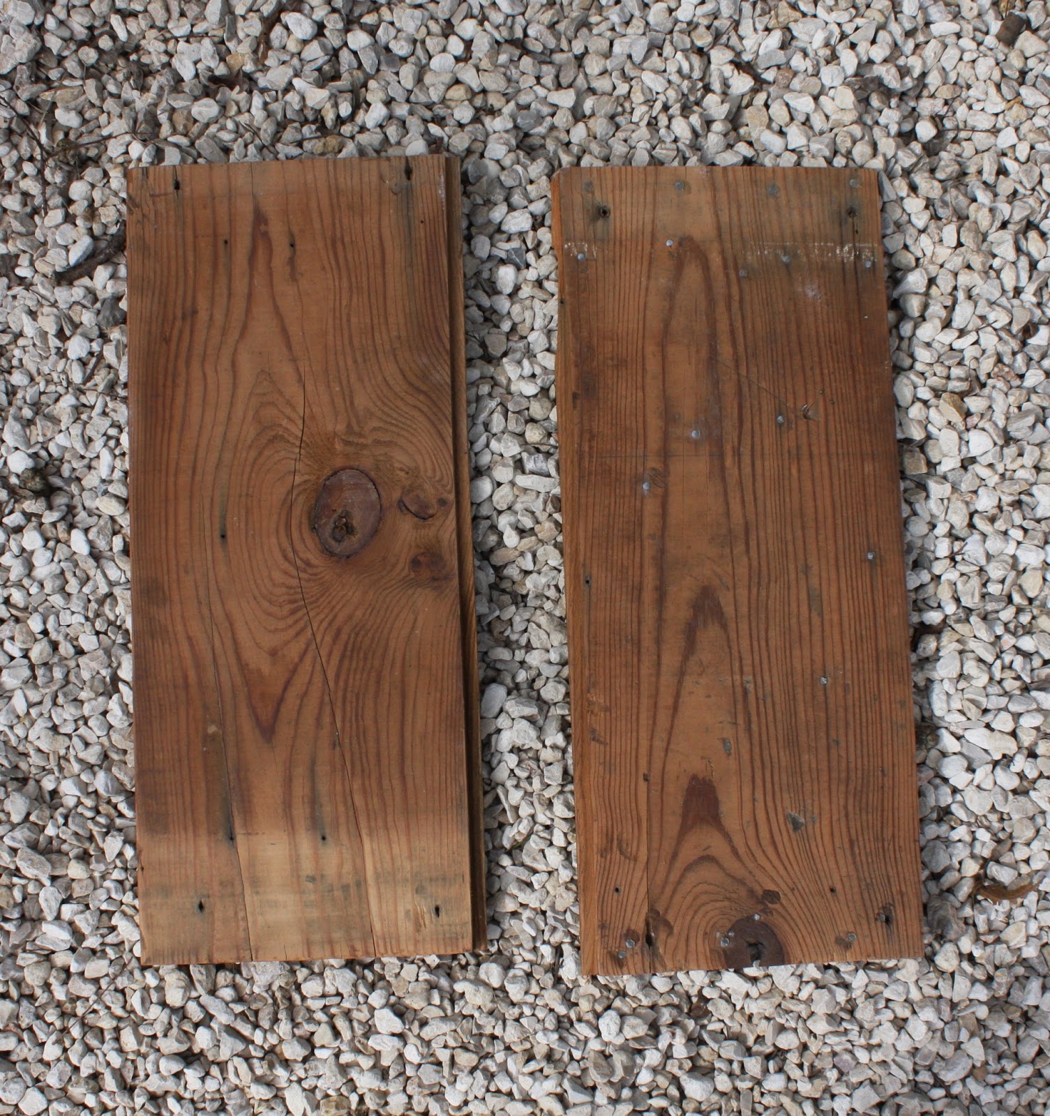
Tyler salvaged the shiplap from a demolition site in our neighborhood, owned by one of the real estate brokers, to whom this office belongs. Shiplap was a tongue and groove wood planking commonly used to build the walls for bungalows built in the early 1900's. Here is a the pile of salvaged wood we still had after building the logo sign.
The top piece on the pile is a section of wall, with the interior wall of shiplap facing up. I had already pulled off the 2 pieces I intended to use for the shelves prior to this photo. On the outside of this piece of wall section, you can see the exterior siding below.
I cleaned the 2 pieces of shiplap and pulled out all of the rusty, bent screws and nails. 
I wiped the shiplap clean and used a Citrus paste wax on the boards. I last used this paste here on the shiplap ceiling of our cabana.
Here are the shelves post wax
I spray painted some metal L brackets in a light gray paint leftover from the logo sign project.
My handyman hung the shelves for me, and we styled them with some liquor bottles and glasses.


Thursday, February 13, 2014

#400...chalk penmanship practice

When my kitchen was shot for Better Homes & Gardens a few years ago, (see article here) I was looking for ways to creatively personalize some of my generic KraftMaid cabinets. I decided to put chalkboard contact paper on a few of the door fronts, which I wrote about here. Below is a picture of the chalkboards as they appeared in the BHG shoot, and a test I did of colored chalks on the boards.

Overall, the chalk (both white and colored) was very dusty, messy, faint and just not that impressive. So, the boards got erased after the shoot, and sat blank for the last year. Then, this Christmas I was scrambling for something to put on the boards to dress them up for the holiday home tour, and I discovered chalk pens, which are much easier to write with, easy to clean, not dusty and much more vibrant. I used them to put up a recipe for eggnog.
I also used them to make this chalk owl art piece.
I have a potential job opportunity to create some chalkboard menus for an upcoming spring wedding, so I decided I should practice my chalk marker penmanship. I got on Etsy for inspiration and copied this recipe for mojitos because it gave me opportunity to practice various fonts. Below the mojito recipe I still had some space, so I practiced designing my own recipe layout and added my fish taco recipe.

Monday, February 10, 2014

#399...for the love of frozen

My nieces have seen the movie Frozen three times. They are pretty in love with it. Above you can see them reading it together while wearing some Frozen character hair clips that my sister Julie bought for them on Etsy.
Pretty funny that one is blonde and one is brunette, just like the Frozen sisters. I've not seen the movie, but apparently it is about sisters being loving and kind to each other, which is something that sometimes sisters need to be reminded of. (Here is a pic of me and my sisters.)
For Valentine's Day, Sarah and I decided to make some costume capes like Anna and Elsa wore in the movie for Audrey and Lyla. We used the above pattern for the Anna cape, and winged it for the Elsa cape, figuring they could either tie it around their neck as a cape, or around their chest, for more of the look of Elsa's ice blue gauzy dress.

Monday, February 3, 2014

#398...reclaimed wood logo sign

For the commercial real estate office space I've been working on this year (see more about it here) we decided to create an artistic logo sign for one of the prominent walls in the conference table area, using the logo that my graphic artist sister Sarah created for the business a few years ago.
Tyler spearheaded this project, because he is the one who creatively suggested using distressed wood for the sign. First, we hit- up a demolition site for some old wood to use. One of the two brokers is about to build a new home on an old lot, so we knew just where to go to scavenge.
First, he pieced together the wood to create a background for the logo. He primarily looked for pieces with white paint on them to serve as backdrop to the colors of the logo.
Sarah sized the logo to a 36 x 36 size, and separated the layers so that they could be printed separately to create stencils for painting.

We cut the shapes out to make the stencils using  X-acto knives.
Holding the stencils down while spray painting was tricky, but having four hands helps.


This weekend we hung the finished sign in the office space.