Thursday, May 27, 2010

#190...ginger jar lamp rehab

I am in California this week baby-sitting my 2 year-old niece. I have been trying to finish up some projects I started in my sister's master bedroom when I was here last. I bought a pair of these 1980's looking ginger jar style lamps at the Goodwill for $10 each for Julie's dresser.
I started rehabing them, by painting them with white primer.

Next, I painted them with a base coat of aqua latex paint, and let it dry completely before moving on.
Then, I taped off a stripe pattern on lamps. Taping horizontal stripes on a round object was a little bit tricky, and I had to cut the tape into small pieces and slowly go around to create even stripes.
After taping, I painted them with a gray latex paint, and immediately pulled the painter's tape off before it dried.

After the final coat, I used some of this silver glaze by Sherwin Williams. I found out yesterday that this product is discontinued, which is really disappointing, as I have used it on walls, cabinetry and accessories and I really like the opalesque finish it gives to a paint job.
We found some square shades at Ross for the unbelievable price of $3 each, and here are the finished lamps atop her dresser.

The original texture of the splatter paint is still visible, but not nearly as 80's inspired or noticeable with their new paint job. Julie wants to change out our bargain lampshades for a drum shade similar to the one on this Crate & Barrel lamp.

Monday, May 24, 2010

#189...Dr. marie's dining room


I spent the weekend on the East Coast celebrating my cousin Marie's graduation from medical school. For graduation, I made her the gallery of abstract palette paintings that you see hanging in her dining room above.
To make the paintings I used palette knives instead of paint brushes to layer the paint on the canvases. I mainly used this shape of palette knife to mix and apply the paint. I simply knife it on and scrape it off until I am happy with the look, allowing it to dry between colors.
I painted the set of canvases all at the same time, so that they would be a cohesive looking grouping. There are many ways they can be arranged depending on the wall space. I think they add a nice modern touch to her historic colonial home.
Here are a few more pictures of Marie's dining room. It is a really beautiful space.

Friday, May 21, 2010

#188...chair as canvas


I bought this chair at the thrift store because of its mid-century lines and scale. The fabric was pretty gross. I got really inspired by the hand-painted swirl pillow in the below House Beautiful spread from the November '09 issue, and decided to paint some fabric to use as upholstery for my chair.

To create my upholstery fabric, I bought some natural colored canvas and used oil enamel and a one inch brush to paint the swirls on the fabric. It has a really sketchy look to it. I bought some green linen-like upholstery to coordinate with the swirl print. Then I took the chair and fabrics to the upholsterer.
It came back today, and here is my new chair....

Wednesday, May 19, 2010

#187...finishing the kitchen quick

My newly remodeled bathroom garnered some attention from an editor at a national magazine that is interested in doing a feature about my kitchen and my bathroom. I am super excited....but there is one minor issue....only one side of my galley style kitchen is completely finished being remodeled.
Luckily, they do not need to take the pictures for a bit, so I have the month of June to finish the other side. The issue with the left side of the room is that for the past 6 years, our washer and dryer have been in our kitchen and a few months ago, we moved them out of the kitchen to their new home in another part of the house. This left a gaping hole in the kitchen and several unpatched holes in the wall. Here is a picture of how it looks today.....the cat currently eats on top of the empty wine refrigerator.
I have plans to remodel this area and the adjoining banquette space, as I have never been happy with the table set-up that is sort of make-shift. I put together an e-board of ideas that I'd like to implement in this space to finish the kitchen.

The first step in my design plan is to decide what type of cabinet to put in the old washer/dryer hole. I want it to be something unique and different than my other cabinetry and to look like a piece of furniture. On the e-board you can see a campaign style cabinet that I saw in a back issue of Lonny magazine. I really like the style and bright color of the cabinet. I found this campaign style cabinet at Goodwill yesterday and got it for $10....(they gave me $10 off because it is in terrible, terrible shape....some of the drawers don't even have sides). I'm not exactly sure that I can save it, but I thought the hardware was worth $10 at the least.


I'll keep you posted on the progress of my kitchen as I quickly finish it up!

Monday, May 17, 2010

#186...antiqued mini pie safe


My client Erin wanted to have this kid-size pie safe antiqued to give it personality, and coordinate with her kitchen. I think she intends for her kids to be able to store their treasures in it. Here is the finished piece.
To antique it, I started by taking the door off, and priming the exterior with my favorite XIM primer. Next I painted the exterior in an aqua blue oil enamel. Once that dried, I painted over the blue in a gold colored oil enamel. Once that dried, I painted over the gold with a cream colored oil enamel. Then I began the sanding using my Mouse sander, applying uneven pressure to the piece to get the paint to sand off in varying layers, revealing the three colors. I paid close attention to the edges of the cabinet, trying to sand them down through the paint colors without sanding too far back to the raw wood. I varnished the entire piece with Watco Wipe-on Poly Satin finish. I decided to stain the interior of the cabinet for a real authentic country feel.
To illustrate the small scale of this piece,  I placed my little 4" Heath ceramics vase with geranium leaves inside.

Friday, May 14, 2010

#185...abstract aspirations

Inspired by the abstract paintings of artist Liz Jardine, whose work has been reproduced as canvas prints and is sold here, here, here, here, here and a million other places, my client Kresta commissioned me to paint her a 36x36 abstract for her living room. Here is Kresta's original acrylic painting that I finished this week.

Thursday, May 13, 2010

#184...my bathroom on design*sponge

Lookie Here......my bathroom renovation from a few months ago is on design*sponge's before and after column today!


Wednesday, May 12, 2010

#183...claw foot refurbish

My bungalow came with a rusty, purple, cracked clawfoot tub that is long gone,
but I saved the feet......
and since I am not using them for another tub, with some cleaning and paint, I turned them into book ends.

I think I saw this idea in Cottage Living a few years ago...or maybe it was This Old House


Monday, May 10, 2010

#182...quick rental reno

On Friday, I shared the mirror we redid for my friend Heather's new place, and today I thought I would share the rest of the quick decorating we did in her new kitchen and living room.
This is the living room pre-decorating, after we arranged the furniture on move-in day....and here is the newly decorated living room.

We turned an old metal frame into a chalk board, and hung it on a furniture piece that used to be in Heather's entry, and now is serving as a side table for the couch.

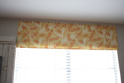
For an easy window treatment, I sewed a simple flat panel of fabric that coordinated with the pillows we made for the room, and then simply used upholstery tacks to nail the valence to the wall. We chose to hang it near the ceiling to raise the look of the window.

Here is another shot of her mirror makeover. Now on to the kitchen....

Above is the kitchen on move-in day. Heather wanted to lighten and break-up all of the wood, so I looked online for ideas, and found that many renters cover their cabinets with contact paper that is easily removable when they go.
We decided to try cutting a silhouette of a fleur de lis in the contact paper since Heather is a New Orleans girl, and to give the kitchen some personality.
To make the contact paper cabinet fronts, we took down the doors and removed the hinges and cabinet pulls. Then we cut out a printed stencil of a fleur de lis, figured out our placement, and traced it onto the back of the contact paper. Next, we cut out the silhouette with an exacto-knife on a self-healing mat, and then carefully adhered the contact paper to the door front. Each door was a different measurement, so there was a bit of math to do figuring out the size of each contact paper front and the exact placement of the fleur de lis.


After completing the doors flanking the sink, we decided that we had lightened up the kitchen enough, and decided to simply finish the rest of the upper cabinets with cut out fleur de lis shapes, instead of continuing the silhouette concept.


To finish off the kitchen, we added a valence in a yellow stripe above the window, again held up by upholstery tacks, and we spray painted her clock hands orange to give the room some pop.
Friday, May 7, 2010

#181...mirror, mirror on the wall

My friend Heather moved into a cute bungalow for rent on my street. I have been helping her arrange her furniture, and do some decorating to personalize her new pad. She's had this wallpaper framed mirror for several years unused.

At some point, (maybe during the move,) the front mirror panel fell off the back wallpaper panel.

So, we took the frame off the wallpaper panel, and used hot glue to recover the panel with fabric.

Next, we re-glued the mirror and frame onto the newly recovered backer board, and
here is our finished result.