Friday, July 31, 2009

#45...the greatest DIY library

I think I have made it pretty clear how much I really enjoy design*sponge. And this week it got even better, as they've updated the way their content is archived, making several of their sections, (including my favorite the DIY section) neatly organized on one page. I am so inspired by all of the creative DIY posts on d*s, and pictured above are three miniature silhouette cutouts I made of my pets, following the instructions on the d*s DIY post on custom paper silhouettes. It was so simple, and cost me $0...(not including the frame cost), because I used scraps of paper I had stuffed in my stationary drawer.

On the topic of pets..........

Last year, I painted my first acrylic on canvas pet portrait, commissioned by my friend Nancy. The photo below is of her sweet cocker spaniel Jackson, my subject. It shows him sticking out his tongue (he does this all the time). I have spent mucho dinero in studio art painting classes, both during college and after, so this is not a DIY project for the masses....I just wanted to share the end result, as it was my first attempt at pet portraiture and I really liked how it turned out....Jackson was pleased too!


Thursday, July 30, 2009

#44...drapery details

I am not a fan of heavy drapery in a room, but I do like to use it to add some drama and help pull a room together. In lieu of spending a fortune on custom drapery, I like to buy ready-made panels and embellish them with contrasting fabrics, as in these photos of my brother's dining room that I decorated last year. His windows have plantation blinds on them, so the drapes are more for decoration than for function. To make his drapes, I used ready-made panels from a chain store, and added the chocolate brown stripe at the top and bottom made from a shimmery, brown, metallic tablecloth that I cut up. I have often used tablecloths and shower curtains to embellish drapes, make table runners, and recover seat cushions, as they are an inexpensive way to get a large amount of fabric. The bottom photo is a "before" of his dining room.
after

before

Tuesday, July 28, 2009

#43...light wrapping


My friend Lisa was looking for an idea to spruce up her plain chandelier. I suggested that she take a look at the work of April Allison of kaarsKoker, which I saw featured on design*sponge last September. I was really taken with the simple idea of wrapping boring lighting parts with pretty paper. The above two shots are from the fabulous pictures featured in the photo gallery on the kaarsKoker website. kaarsKoker sells the pre-cut paper sleeves, or you could use any paper and make your own as Lisa did below. Her paper sleeves are made from last season's Ikea holiday paper, which she got on clearance for $1 this past spring. She chose to use two different paper patterns on her chandelier, which I think gives it even more personality and whimsy. The paper is gold matte and white and beautifully subtle.....plus she probably had enough left over on her roll to wrap several gifts, or line several drawers, or. . . . . the possibilities for gift wrap are really endless, don't you agree?


Friday, July 24, 2009

#42...mom's living room

before
For the past few months, I have been helping my parents update a few rooms in their house. Pictured above is their formal living room, a room that as kids we were not allowed to step foot into. Because the room rarely got used, all of the furniture was in great shape, despite that it was bought decades ago. In redecorating/updating the room, the layout actually stayed much the same, and many of the furniture pieces are the same, but overall it looks really different.
after

To begin this redecorating process I clipped magazine and web pictures of inspiration rooms, colors and upholstered furniture pieces that I thought would work for the room. I presented several options of fabrics and wall colors to my parents, and they chose what they liked. It was helpful to them to have the choices narrowed down, and the inspiration clips made it easier for them to envision the finished product, and make the leap to change decor.

The love seat got a new navy and cream stripped fabric, and we chose not to put a skirt on it. It features some contrast solid cream colored piping on the pillows, which is the same fabric that was used on the wing chairs in the room. The wing chairs got some nail head detailing to give them some personality.

My Dad and I built two lighted corner cabinets to flank the piano and to provide some pretty shelving for their collectibles. The round glass coffee table was a thrift store find, which I painted. The rug is from Overstock.com, and is much bigger than the rug they previously had in the room. It makes the room feel so much more spacious than the smaller rug did.


Dad and I also built the cornice boxes for the windows to match the crown molding in the room and on our corner cabinets. I made the drapes from a pair of textured shower curtains and added a metallic aqua and silver circle upholstery print as a big stripe at the bottom of the drape for drama. (unfortunately, you can't really see the bottom of the drape in these pics).

The velvet flower painting hanging between the windows was done by my great uncle in the 1960's. It is still in its original frame, but I decided to paint the frame to match the coffee table. The frame was originally gold, and the paint was wearing off and looked dirty, so it warranted a paint job. I think it still has its vintage charm though.
In total, this makeover cost less than $2000, for all of the fabrics, upholstery, new furniture, rug, accessories, and supplies that Dad and I used for painting and the wood working projects. They love how it turned out, and although it is still a formal living room, my Mom has been inviting friends and family to sit in there for a visit.....even us kids!

On a side note......the original brown wood coffee table that you see in the "before" shot found a new home as an ironing board table base in my studio. You can see the after here.

Sunday, July 19, 2009

#41...refreshed dresser

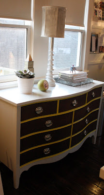
This dresser really does not need much explanation. I bought it for $60, and used less than $15 of enamel paint and stain to refinish it. The knobs were original, but were replated. It is one of my favorite pieces that I have worked on.
before
after

Friday, July 17, 2009

#40...endtable to beside bench

When I found this pair of end tables at the thrift shop, I really liked how they looked, but the wood needed a little TLC. I sanded and restained the fronts of the drawers, painted the exterior with a light grey enamel paint, and the legs with Citron yellow by Benjamin Moore. I had the drawer pulls replated in a brushed nickel. The end tables originally cost $10 each, and the paint supplies and refinishing of the pulls cost about $60. I have them pushed together and use them as bench at the foot of my guest bed.

before

after


Wednesday, July 15, 2009

#39...new old lamp

I have this folder of "before" photos on my desktop, and it is time to match them up with their "after" shots and post them together. So, here is the first of a few to come. It is a thrift store store lamp that you can find in abundance at most thrift stores for less than $15.

Here is the after. I simply spray painted it white, and added some gift wrap to hide the ugly plastic yellow tube portion. I cheated a little because I swapped the shade out for a smaller one from another thrift store lamp. This shade was formerly a brown color, and I spray painted it white as well, and then decided to jazz it up by dripping silver paint on it. The total cost of the lamp was less than $20, and took about an hour to complete.


Monday, July 13, 2009

#38...a shade fit for romans

Roman shades are really pretty simple to make. O.k......there is a little math to do, but other than that they're fairly easy. The best part about making your own, is that you can choose any fabric that you want, opting for a something like a sheer linen that lets filtered light through, or some very opaque fabric like outdoor upholstery fabric that nearly blocks out all light. The second best thing about creating your own roman shade is that it can be really inexpensive depending on the cost of the fabric that you choose. Other than the fabric, all other supplies needed cost less than $10.
Here are my step-by-step instructions for making an interior mount roman shade.
1. Measure your window width and height and add 5 inches to width measurement and 15 inches to height measurement to give yourself plenty of fabric.
2. Finish sides of shade by turning at least 1/2 " to back of shade and stitch down sides from top to bottom. Make sure that finished width fits inside your window, and alter as necessary. This would be the time you could stitch a liner in if you desire.

3. The shade will consist of a top pocket to hold a tension rod, and at least two dowel pockets to create the folds, and a bottom pocket that also holds a dowel rod. The first pocket to make is the top pocket. Fold 1/2" under at the top and then fold over again about 2 inches, creating a pocket for the tension rod. Sew across top from side to side making the pocket.
4. Next determine how low you want your shade to hang on your window when completely pulled up. (Like determining the appropriate height of a valance for a window. ) Most of mine have been between 12-20 inches depending on the height of the window. Then divide the total height of the shade by 3 or 4 or whatever number gets you to your predetermined pull-up height. The drawing to the left shows the back of the shade bisected into 3 segments with two center dowel pockets. Fold the shade right sides together on marked segment lines, and sew a 1' seam, from side to side creating the dowel pockets.
5. Now create the bottom dowel pocket in the same manor as you did the top tension rod pocket. I sew the bottom pocket last to insure that even if I miscalculate the center fold pocket lines, I can hold the shade up in the window and hem the bottom pocket to the correct length.
6. Using 1/2" plastic curtain rings from the hobby/fabric store, hand sew on to bottom pocket and center fold pockets on each side of shade about 2" from the edge, making sure that the rings line up all the way up. Do not put a ring on the top pocket.(See above drawing to see ring placement.) If your shade is wider than about 30 inches, you may want to add a third ring row in the center of the shade to help lessen the stress on the edges when drawing up the shade.
7. Using drapery cord string, cut two lengths at least 3x the height of the window. Tie each piece of string to each bottom ring, and string up through rings.
8. Cut dowels to the appropriate width, and insert into center pockets and into bottom pocket. Slide tension rod of appropriate width for your window into top pocket and loosely position in place. Make a mark on the top inside window frame behind the tension rod (& shade) in line with the rings. This mark is where you will put an eye hook into the frame of the window as guides for the string. Opt for small 1/4" screw in eye hooks. (You can also see these in the shade back view drawing)
9. Position your shade and run the string through the eye hooks and over to one side of the window. Once the shade is positioned and the string is over to the side and you have pulled it up and down a few times, you will want to knot the two strings together and maybe add a pull or tassel of some sort to make drawing the shade easier. To keep your shade drawn, you will need to wrap your sting around a small boat tie that you position on the side of the window that the string pull is on.
Well.......now that I have written this all down, I am not sure it is as easy as I was thinking. If you attempt it, there will be some learning curves, so don't start with expensive fabric. Once you go through the steps once, the instructions will become less daunting and easier to understand.....otherwise, there are some nice store bought shades out there too!
Here are a few shades I have made. Each one gets easier than the last...........


Friday, July 10, 2009

#37...setting the stage

I recently took a job staging homes for a local realtor. I don't have any formal training in this area, just a passion for home design, and a background in studio art and fashion, which I think has helped hone my interior design abilities.

When I started, I was not sure I would like staging, since staging a home to sell involves depersonalizing the space, and most of my decorating endeavours are about infusing individual personality into a room. Surprisingly, I have really enjoyed the staging challenges. Using their own possessions, I have helped sellers rearrange, clear-out, and update. It is really cathartic to help someone de-clutter.....now if I could only tackle some staging of my own closets and unruly garage!

Here are a few before & after shots from the first home I worked on.

Master Before
Master After

Study Before
Study After
Guest Room Before
Guest Room After

Wednesday, July 8, 2009

#36...porch panache

Here is the finished result of my decorating endeavours for Nancy's new front porch room. A bench, a rocker, two round coffee tables that double as seating, a small side table, an outdoor rug, and some easy-care potted plants furnish the porch. The space is a cozy 6x9 feet in size, and offers seating for 5 or 6 friends to enjoy a cool summer beverage.

The bench and rocker were both purchased at discount chain stores and tweaked to coordinate with the new porch color scheme. I recovered the cushion that originally came on the bench, and added a striped panel down the center or the rocker webbing to tie the pieces together. I found some two-sided Ikat-like fabric and sewed the pillows for the bench. The outdoor rug came from Home Decorators.com, and the small side table under the window that has a plant and citronella candle on it, came from a local thrift shop. I spray painted it to match the color of the powder-coated aluminum rocker.


porch before


porch after


I like to paint spiders, butterflies and other bugs. I painted this spider using metallic fabric paints on sunbrella fabric for the rocker.


The two round yellow coffee table/stools are my favorite thing on the porch. I found one at Marshall's and scoured several stores looking for a second one, with no luck. I decided to have Tyler help me build a second table. Using the wooden vase pictured here to the left, we cut it down to the appropriate height, and cut two circles out of plywood for the top and bottom. We attached the wood column vase to the circles using screws and Gorilla Glue. Next both tables got sanded, as they were both originally dark brown. I spray primed them and then sprayed them the yellow color with an exterior spray paint. I think they really add some pop to the porch. Now........ as soon as the temperature dips below 100 degrees, I know several friends and neighbors who can't wait to sit out there relaxing.... a mojito in hand.

Monday, July 6, 2009

#35...railing realities


porch before

This is my friend Nancy's house. She has become quite the DIY'er, so when she decided to makeover the front porch on her early 1900's bungalow, Tyler and I encouraged her to try building her own railing, instead of hiring someone to do the project. We offered to help her, so one recent Sunday the three of us set out to complete the railing project.
I would like to tell you that we measured twice, cut once, and completed the project in a few easy hours, but in actuality we measured eight times, still mis-cut some things, and took about 4 hours longer than we thought we would to complete the railing. But....when all was said and done, it turned out great. Nancy spent about $500 on railing materials and saved at least that much if not double in labor costs by doing the project herself.
Once we finished, it looked so nice that she hired me to decorate her new outdoor room, so stay tuned for photos of the new decor upcoming this week.
under construction


and...we're finished!

Thursday, July 2, 2009

#34...puppy love

jeannie & me: september 5, 1998
This afternoon, my dog Jeannie went to dog heaven. She was 95, (that's 13 and a half in people years.) It has been one of the hardest weeks of my life, and words can not express how she will be missed. She gave Tyler and I so much love, attention, laughs, and licks over the years and she will be in our hearts forever.

My pets spend their days laying around my studio floor, lazily watching me work on my latest endeavour. Each of them has at some point participated in some DIY project that I subjected them to. Pictured below, is one of the first ceramic pieces that I fired when I got my kiln back in 2001, and it is none other than Jeannie's paw print. She made the bowl as a gift for Tyler for Valentine's Day, and as I dug it out of the cabinet today, I smiled at seeing it, and it reminded me of how artwork often outlives the artist....even the furry ones.